Abrel was founded back in 1994 (yes we will be celebrating 30 years in business next year!) and over the years the technology, the industry itself and our related products and services have all obviously changed considerably.
Yet we had done little to reflect this progress in our branding, which has been much the same since the business began. Hands up any of our clients who actually know or thought about what the word Abrel stands for? In fact, it’s Advanced Burn-in and Reliability” – which was the original tag line.
Recently we initiated a project to re-invigorate the Abrel brand and to develop a new, modern brand identity and clear guidelines for the consistent implementation of the brand. We wanted the logo and the brand positioning to accurately reflect the remarkable evolution of the business.
We took a consultative approach to the project and involved the team early-on – brainstorming the strengths of the business and how this might be represented to prospective customers. We also appointed local branding agency Blink Design – to guide us through the process and share their expertise so that we could develop a comprehensive set of brand guidelines.
Here’s what we were keen to convey to the world –
that we are always evolving, focused on our partner’s needs, and ready for anything the future brings.
And here’s what we did!
Abrel – More than Products!
Formerly branded as ‘Abrel Products Ltd’, we decided to rebrand simply as ‘Abrel’. While products continue to be a mainstay for the business, and we maintain our commitment to providing exceptional burn-in solutions – we also add considerably more value in terms of product design and related consultancy services.
But we also wanted continuity, so our original brand identity colours, the well-established red and navy palette, remain intact, representing the strength and robustness of business.
A New Font – Andes
Our chosen brand font, ‘Andes’, perfectly captures the essence of our brand heart: Reliability, Distinctiveness, and Progressiveness. The decision to present our brand name in all caps, as ‘ABREL’, echoes our long-standing presence and expertise in the industry. With years of experience under our belt, we continue to push the boundaries of burn-in solutions. We decided to use Caps to make that statement clearly!
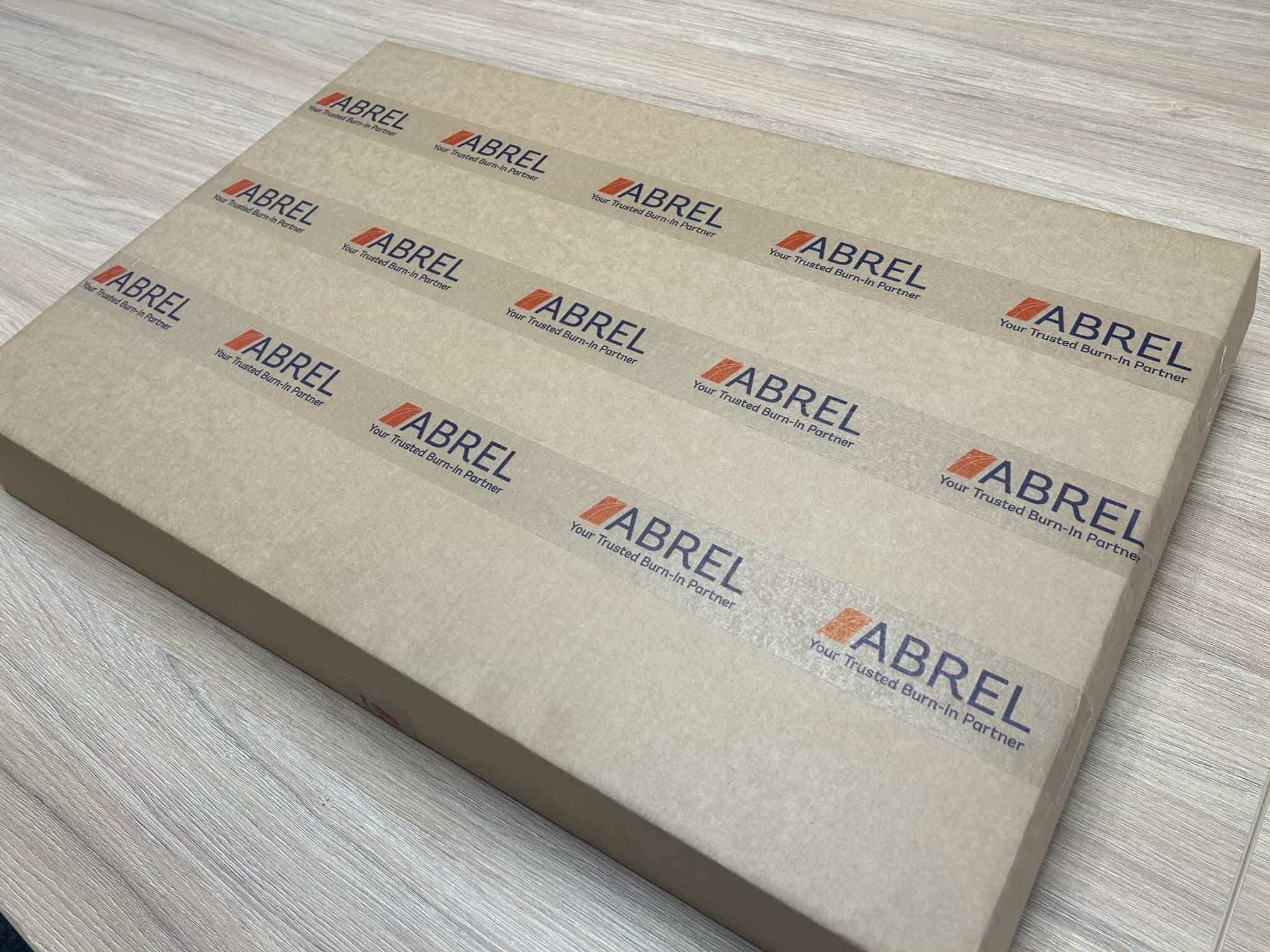
A Logo Encapsulating Our Evolution
Our new logomark beautifully encapsulates the transformation Abrel has undergone over the years. Symbolising progress and growth, our contemporary logomark exudes a forward and upward movement. The meeting point of the two upward curves at the top signifies the strong partnership we forge with our customers. The outer curve represents Abrel, while the inner curve represents our customers, showcasing our collaborative and mutually beneficial relationship.
Abrel – Your Trusted Burn-In Partner
To unify the new brand identity, we introduced the tagline ‘Your Trusted Burn-In Partner’. This tagline embodies our commitment to building trust and serving as a reliable partner in fulfilling the burn-in needs of our customers. We understand the significance of exceptional technical support, engineering expertise, and comprehensive services such as design and development, test and validation, and ongoing technical assistance. And of course, partnerships work best over the long-term – Abrel has many long-standing clients that we have worked with for decades.
Our Strengths and Values
One of the most interesting outcomes of the branding project was the identification of our brand attributes. This was done through a workshop facilitated by Blink Design. It was great to get the different views of the team members – a number of whom have worked for the business over many years – and to feel and hear the passion that we have for Abrel, each other, and our clients.
Our Top 5 Brand Attributes
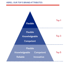
You’ll notice Flexibility stands as one of our top brand attributes. We understand that every customer has unique requirements and challenges, and we pride ourselves on our ability to adapt and tailor our burn-in solutions to meet those specific needs. Whether it’s customizing burn-in boards, designing specialized burn-in systems, or providing flexible test probes and sockets, we prioritize flexibility throughout our entire product and service offering.
One of the reasons we can achieve this level of flexibility is that we are an extremely Knowledgeable and Competent team. Our engineers possess a deep understanding of burn-in technology and have extensive experience in the industry.
But we wouldn’t be in the right industry if we didn’t understand and deliver Reliability! This is clearly critical to the whole nature of burn-in testing. And quality control is a key aspect of this process.
Lastly, Innovation is an integral part of our brand DNA. We are continuously exploring new technologies to stay at the forefront of burn-in testing.
Now that we have our new logo, brand guidelines and insight into our strengths, we trust that the brand will see us safely through to another 30 years and beyond!
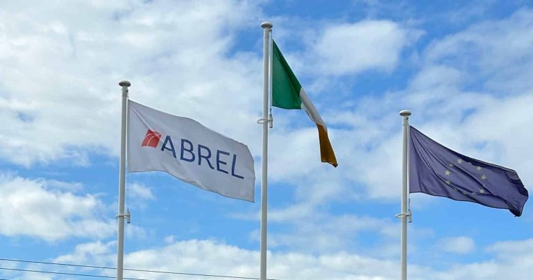
If you visit the facility, the Abrel website or spot one of our fleet of branded vehicles, you’ll see how we implemented the new branding across all our assets.
What do you think?